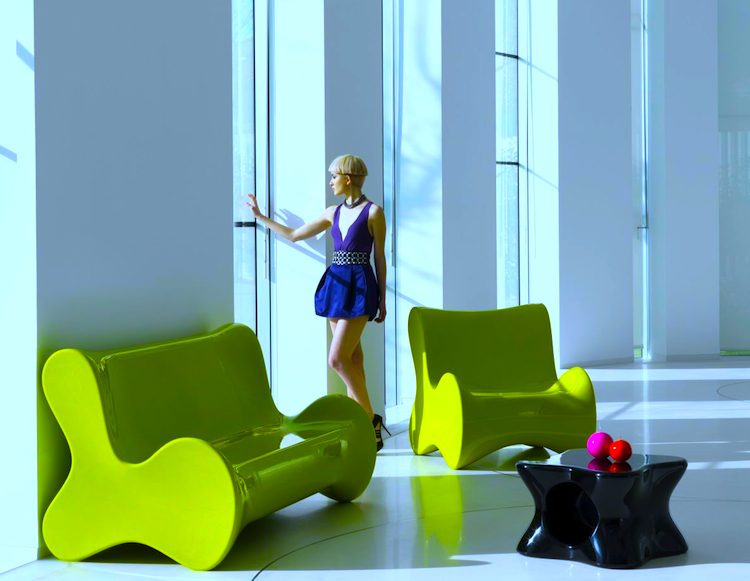
By David Ross. Gary Hustwit’s Objectified (2009) is a cerebral documentary about industrial design. It considers everyday products we don’t usually think about as solved physical puzzles – peelers, garden sheers, computers, cars – and presents the thought processes of those who do the solving. The documentary is articulate, but also tendentious and leading. It purports to explain and defend ‘good design,’ but what it actually defends is a stringent minimalism and futurism. Its approved objects are clean lined, smooth surfaced, mono-tonal, ergonomic, and – in its dreams – ‘sustainable.’ This is the design philosophy of Apple, IKEA, and OXO – the spirit of molded plastic chairs and cell phones everywhere – in direct descent from the manifestoes of the Bauhaus.
Karim Rashid, who’s interviewed here, dubs this aesthetic the ‘techno-organic,’ but the phrase is faulty. The organic is not merely curvilinear, but alive with complexities, contradictions, coincidences, exuberances, excrescences, and self-assertions. The techno-organic school embraces the organicity of the egg shell but not of the emergent salamander or bluebird, which, as it were, travesty the perfection of the shell. Jonathan Ive, senior vice president of design for Apple, expresses the ideal:
I lot of what we seem to be doing in a product like that [the iPhone] is getting design out of the way. And I think that when forms develop with that sort of reason and they’re not just arbitrary shapes, it feels almost inevitable, it feels almost undesigned.
Erwan Bouroullec, a French designer:
Often our hardest job is to remove, remove, remove, bit by bit, anything that is unnecessary, that gets in the way of maximum unity.
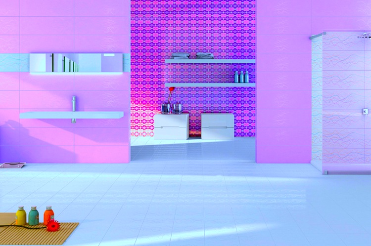
As much as these designers claim to grope for an ideal of ‘unity’ and ‘simplicity,’ the motive seems more Oedipal than Platonic. Their project is largely negative, a rebellion against the past and the lineage of cultural form. They seem to consider the analog era, with its stench of machine oil and imperfection of wood grain, an illogical fungal growth, a sepsis in need of anti-septic. The designers are remarkably forthright in this regard. Marc Newson:
Ultimately my job as a designer is to look into the future, not to use any frame of reference that exists. My job is about what’s going to happen, not what has happened.
Karim Rashid:
We have advanced technologically so far, and yet there’s some sort of paranoia where we’re afraid to really say that we’re in a third technological revolution. I have an iPod in my pocket, I have a mobile phone, I have a laptop, but then somehow I wind up going home and sitting on wood spindle chairs. In a way you could argue we’re building all these really kitsch stage sets that have absolutely nothing to do with the age we live in. It’s strange – perverse in a way. Imagine right now I’m sitting with my laptop and say I have to go out and get my horse and carriage. Why do we feel like we have to keep visiting the same archetype over and over and over again?
Let me answer on behalf of civilization: We revisit certain archetypes over and over because they speak to our human nature and recall the verities of our culture. We revisit these archetypes because they bind us to our ancestors. We revisit these archetypes because in the democracy of history our generation is out-voted.
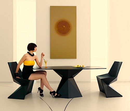
In contrast to the aesthetic of the archetypal, Rashid’s aesthetic is alienated and inhuman; its concerted attempt is to create form without affect or basis in value and belief. Its adopted ideal is the kind of sterility that Zamyatin’s We and Huxley’s Brave New World warn us against, and its motives are well articulated by Huxley’s Mustapha Mond. Humanity – the old labor of conscience and purpose – is a burden. Anything that recalls us to this labor is a burden. Rashid’s designs are the reification of the spirit of Soma.
Enjoy your molded plastic. The Parthenon has buried a hundred generations and it will bury ours.
I appreciate an ergonomic rubber grip as much as the next fellow with potatoes to peel, but even more I delight in brocade, wood grain, oxidized copper, bone china, foliations of wrought iron. I like nooks and crannies and knobs. Give me a skeleton key or a winding staircase. Give me symmetry and pattern. True, my OXO peeler allows me to peel five potatoes in the time I previously peeled three, but the Tiffany serving spoon I inherited from my grandparents turns a bowl of strawberries into a detail from a painting by Nicholas Lancret or Fragonard. The questions are: Should design cater to the hand or appeal to the imagination? Should it assure us of our modernity or our humanity?
 Let me offer my own little counter-exhibition on reverse principles:
• Gallery, Syon House (1763-8), by Robert Adam.
• Pulteney Bridge (1774), Bath, by Robert Adam.
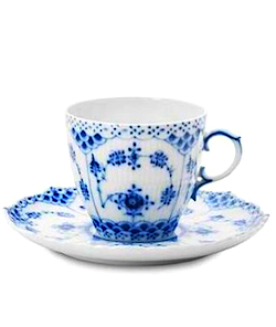
• Teacup and Saucer (design dates from 1790), Royal Copenhagen (see right).
• The Kelmscott Chaucer (1896), by William Morris and Edward Burne-Jones.
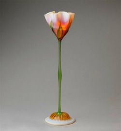
• Lamp (1900-1902), by Louis Comfort Tiffany, Metropolitan Museum of Art (see above).
Posted on November 7th, 2010 at 9:50am.
Isn’t this design esthetic of “Objectified” in effect a return to the modernism of the 30s through 60s?
While I dislike minimalism in design for it’s own sake and with no purpose, good modernism can be just as pleasing as say art nouveau or even more baroque forms of expression. The Parthenon may be an immortal design, but you don’t have to build in fluted marble to capture the same elements of golden proportion.
I’m a fan of the midcentury house design (e.g.Echler house), where the ornamentation isn’t fancy convoluted ironwork or quadruple eves but is expressed in the mathematical relationships of it’s elements while also incorporating comfortable wood textures. In addition, the simplicity has a purpose – to eliminate unnecessary detail while rendering the cost of the house as low as possible. This clever attribute can be beautiful for it’s own sake, like the efficiency of a well designed machine. So if you offer me a Ferrari 458 vs a 1937 duesenberg, I’ll go for the Italian every time.
K,
You make a good point, but I think there is a subtle difference between the regnant “biomorphism” of “Objectified” and mid-century modernism. Whether in design or literature, modernism in so many ways rooted itself in the traditions of Western culture, attempting to revitalize them by giving them a new formal expression and modern application. In literature especially — Joyce, Woolf, Yeats, etc. — this was an entirely successful adventure in ideas; in design and architecture, somewhat less successful, as a destructive egalitarianism and anti-humanism crept into the equation, through the influence of the Bauhaus, though late-modernist architects like Norman Foster and Santiago Calatrava seem to have revived a purer and more successful modernism. Post-modern design — let’s call it biomorphic — feels so shallow because, like the films of Tarantino, its reference points are so self-reflexive and pop cultural. It has no sense that it stands at the end of a long and increasingly desolate lineage. It lacks historical consciousness and cultural memory, which even the rebarbative modernism of the Bauhaus has in spades.
I would choose the Dusenberg over the Ferrari, by the way.
Luddite. 🙂
Yes, I see now what you are getting at. And BTW, I enjoy your pieces here. Thanks.