Meet The New Wonder Woman + First Look Look at The New Superman

By Jason Apuzzo. Hey! Word broke today that Friday Night LightsAdrianne Palicki will be the new Wonder Woman in David E. Kelley’s reboot of that TV series for Warner Brothers. My first reaction? So far, so good – at least in the looks department. I assume, incidentally, that Ms. Palicki will be playing the role as a brunette (she’s worked previously as both a blonde and as a brunette).

Whether this new TV series will be in any way working off the D.C. Comics reboot of the character, a reboot which sparked a controversy last year (which we covered extensively here at Libertas), is unclear. Here, however, is how the series is described over at Deadline:

In the reboot, from Warner Bros. TV, Wonder Woman/Diana Prince (Palicki) is a vigilante crime fighter in L.A. but also a successful corporate executive and a modern woman trying to balance all of the elements of her extraordinary life.

So there it is. We apparently can have successful female corporate executives on TV, by the way, but not in the Governor’s office in Sacramento.

And on that point, since Diana Prince is now going to be a corporate executive, I definitely advise her not to bother doing business here in California, where Warner Brothers is based  – because it’s too expensive. Try Texas or Arizona instead. Or perhaps she could tie the ‘lasso of truth’ around our new/old California governor, and get him to admit that we’re all going to be living out of garbage cans if he raises taxes? Perhaps they could put that in the pilot episode!

In other superhero news, incidentally, we’re also today getting the first, semi-official look at the new Superman, Brit actor Henry Cavill, in the latest edition of EW.

There’s been a certain amount of controversy lately over the fact that he’s a Brit playing an iconic American character, but since America seems to be outsourcing everything these days, why not our Superman? [Sigh.] My choice for Superman would’ve been Mark Sanchez.

Posted on February 17th, 2011 at 10:46am.

Atlas Shrugged as Science Fiction

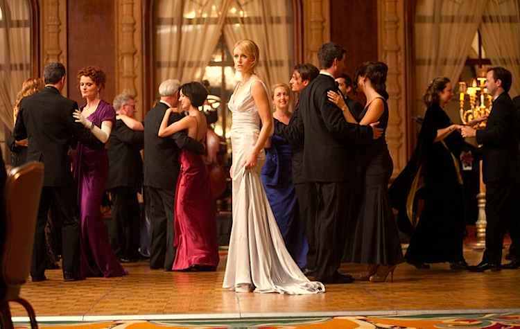
Taylor Schilling as Dagny Taggart.

By Jason Apuzzo. I’ve been trying to crystalize my thoughts on the Atlas Shrugged trailer since seeing it Friday. As a coincidence, I recently finished reading Atlas Shrugged – for reasons other than the film’s release, as it turns out, but which nonetheless put me in the mood to see the trailer and get a sense of what the filmmakers had done with the material.

On seeing the trailer, something occurred to me that I’d mentioned to director Paul Johansson when we were on the film’s set – which is that Atlas Shrugged, which was first published in 1957, takes place in a kind of alternate, indefinite future. The precise nature of that future, its look and feel, struck me as being something that a filmmaker could exploit to great advantage, particularly in so far as Rand’s novel veers strongly toward dystopia late in the story – depicting death rays, fascistic military police, optical refractor beams, and the like. Reading the novel, it seemed to me that Rand’s story was rife with possibilities to create a filmic world similar to that of Fritz Lang’s Metropolis or Ridley Scott’s Blade Runner – albeit of a different, less nightmarish cast.

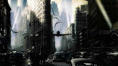
From "Sky Captain and The World of Tomorrow."

What complicates matters, of course, is that our vision of ‘the future’ circa 1957 was much different from our vision of the future today. Rand’s novel deals primarily with the railroad and steel industries, for example, industries that have lost their futuristic sheen amidst the successive eras of the Jet Age, Space Race and Information Age. (In fact, trains and steel had already lost their glamor, so to speak, by the time Rand wrote her novel.) Suffice it to say that today’s Hank Rearden would not likely be pouring steel; nor would Dagny Taggart likely be operating a railroad. Indeed, I suspect Dagny would be somewhere in Silicon Valley pushing forward the boundaries of the Information Age, while Rearden might be in a clean-room designing next-generation microchips.

This, ultimately, is why I think Atlas Shrugged – in order for it to be faithful – is probably best set during the 1950s, albeit in an ‘alternate’ version of the 1950s. I’m thinking here of something like the alternate version of the 1930s presented by Kerry Conran in his flawed but interesting fantasy epic from 2004, Sky Captain and the World of Tomorrow.

In that similarly low-budget effort, Conran used digital technology to create a stylish, alternate 1930s of flying robots, advanced Nazi superweapons, airplane-submarines and flying air bases in order to bring to life a fanciful story of how World War II ‘might’ have been fought, had a few scientific super-geniuses had their way. This, it seems to me, might’ve been a interesting approach to take with Atlas Shrugged. Ultimately, however, Paul Johansson never really had the opportunity to contemplate such an option – in so far as he was hired to direct Atlas Shrugged just over a week before cameras rolled, an extremely challenging situation for any director, let alone someone charged with a project of this scale.

I don’t think such a retro-futuristic approach would’ve made the film more expensive to do. It is, in fact, quite possible these days to create realistic sci-fi dystopias on a budget. To show one recent example of this, I’ve embedded below the trailer for award-winning writer-director-ILM visual fx designer Grzegorz Jonkajtys’ recent film The 3rd Letter (previously titled, 36 Stairs), about which I’ve posted here at Libertas previously.

The 3rd Letter takes place in a polluted, dystopian future-metropolis in which human beings depend on bio-mechanical alterations in order to withstand the deteriorating climate. The full film is about 15 minutes long, quite lavish in its visual design, and was apparently made on a budget of around $7000. The film quietly speaks volumes about where independent filmmaking is headed, in terms of how technology is currently able to support highly expansive visions.

Contrary to what many people have been saying, I don’t believe Atlas Shrugged is a project that needed a $200 million budget or the participation of Angelina Jolie/Charlize Theron to do it properly. What the film did need, in my opinion, was an audacious cinematic vision to match Rand’s own.

We’ll soon see if that’s what it got.

[Editor’s Note: It also occurs to me since writing this post that, if one were to ‘update’ Atlas Shrugged to the world of today, it would be interesting to have Dagny working in the post-9/11 airline industry, with Rearden providing lighter, stronger metals for her airplanes. Plus: imagine the fun one could have depicting the TSA.]

Posted on February 16th, 2011 at 11:26am.

Interrupted Lives: Portraits of Student Repression in Iran Now Available

By Jason Apuzzo. With the protests currently taking place in Iran, we wanted to alert Libertas readers to a short film called Interrupted Lives: Portraits of Student Repression in Iran (see the trailer above). Interrupted Lives is a 20 minute documentary that deals with the repression of free-thinking students by the Iranian government, and specifically examines documented human rights cases of student imprisonment, torture or execution since the 1979 revolution.

The film is available to be seen in full here. Interrupted Lives will be traveling to major university campuses this Spring – including Harvard, Berkeley, and Oxford. We wish the filmmakers the very best in this important effort.

Posted on February 16th, 2011 at 10:18am.

Mad Men & Boomer Revisionism

[Editor’s Note: Mad Men Season 4 , reviewed in full here at LFM by Jennifer Baldwin, will be released on DVD/Blu-ray March 29th.]

By David Ross. Our own Jennifer Baldwin has written stylishly – very stylishly in my opinion – on Mad Men. I share her admiration for the glamour of the era, and I particularly share her instinct that the Eisenhower generation in some sense enabled the mayhem of the 60s:

The reason AMC’s original series Mad Men was such a sensation when it debuted four seasons ago, and what continues to make it one of the best shows on TV, is that it approaches the 1960s from a somewhat different angle. It’s the angle of men in suits, women in tasteful and elegant clothing, cocktails and business meetings – in other words, the world of grown ups. This is the 1960s from the point of view of the adults. What makes the show so brilliant is that by focusing on the adults of the era it shows where the real breakdown of society occurred in the 60s:  not with the kids, but with their parents.

Kids will always rebel, in any era, in any time period. It’s part of our adolescent development to test boundaries and question our world. But it’s up to the adults in a society to maintain civilization in the face of this adolescent upheaval. Where the 60s went wrong – where the rot set in – wasn’t that the youth started tuning out and turning on, it’s that the adults did as well.

This is well put: it is indeed “up to the adults in a society to maintain civilization in the face of [……] adolescent upheaval.” As I see it, however, the essence of the sixties dysfunction was not that the adults tuned out and turned on, but that they did not entirely trust in their own culture and world view. Their liberalism was too relativistic, pluralistic, urbane – too unsure of itself at root – and they had become unconsciously estranged from the tradition that should have functioned as the great countervailing force: the ‘culture’ that should have thundered in refutation of the ‘counter-culture.’ Too tentative to muster the necessary ferocity or tenacity, they failed to acculturate their own children, and they suffered the patricidal consequences.

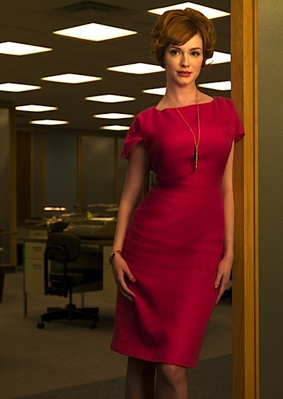
Christina Hendricks as Joan Holloway.

The ultimate origin of the problem is hard to identify. Could it be that having won World War II and vanquished the most monstrous manifestation of evil in the history of the world, the Eisenhower generation let its guard down? Assumed that the culture needed no further defense? Or was this generation simply – and forgivably – a bit weary at the core?

There is a subtle point to be made, but Mad Men – of which I have seen only the first season – does not seem to make it. Instead, the show depicts the culture of the 50s and early 60s with a heavy-handed Baby Boomer bias, turning a complicated and often brilliant era of American art and culture – the era of Nabokov and Coltrane – into a flimsy straw man of political convenience, as if to say, “You see! This is why we had to wreck the world in order to save it!” I have previously aired something of this complaint in my “Defense of the 1950s” (see here).

I simply don’t accept the clichés in which Mad Men tirelessly traffics. My grandparents belonged to the exact generation of Mad Men and occupied a Jewish version of the same milieu. My grandfather was a corporate lawyer in Manhattan, a drinker of good Scotch, an amateur photographer (I have his lovely old Leica), a dapper wearer of Burberry coats and felt homburgs, a weekend golfer with a second house in Westport, Connecticut. Mad Men‘s revelry in boorishness and chauvinism – its excited finger-pointing at sexual naughtiness and latent dysfunction – seems utterly detached from my grandparents’ unselfconscious sophistication and from the real elegance of their world. This world was sober, thoughtful, and ordered. It was perhaps a bit passive and naively broadminded, but it was not stupid and never crude. It was a middle-brow world, but middle-brow, in 1960, encompassed the Museum of Modern Art, The New Yorker, and the New York City Ballet.

Daniel Mendelsohn, writing in The New York Review of Books, weighs in with a lengthy and devastating critique along my own lines. He derides the show as cheap soap opera, an obligatory point in the pages of NYRB and one that the show’s defenders are likely to concede with a shrug. He may touch a nerve, however, when he denies “the special perspective [the show’s] historical setting creates, the graphic picture that it is able to paint of the attitudes of an earlier time, attitudes likely to make us uncomfortable or outraged today.” Mendelsohn continues:

To my mind, the picture is too crude and the artist too pleased with himself. In Mad Men, everyone chain-smokes, every executive starts drinking before lunch, every man is a chauvinist pig, every male employee viciously competitive and jealous of his colleagues, every white person a reflexive racist (when not irritatingly patronizing). It’s not that you don’t know that, say, sexism was rampant in the workplace before the feminist movement; it’s just that, on the screen, the endless succession of leering junior execs and crude jokes and abusive behavior all meant to signal ‘sexism’ doesn’t work – it’s wearying rather than illuminating.

Here, as with Don’s false identity and (literally) meretricious mother, Mad Men keeps telling you what to think instead of letting you think for yourself. As I watched the first season, the characters and their milieu were so unrelentingly repellent that I kept wondering whether the writers had been trying, unsuccessfully, for a kind of camp, for a tartly tongue-in-cheek send-up of Sixties attitudes. (I found myself wishing that the creators of Glee had gotten a stab at this material.) But the creators of Mad Men are in deadly earnest. It’s as if these forty- and thirty-somethings can’t quite believe how bad people were back then, and can’t resist the impulse to keep showing you.

This impulse might be worth indulging (briefly), but the problem with Mad Men is that it suffers from a hypocrisy of its own. As the camera glides over Joan’s gigantic bust and hourglass hips, as it languorously follows the swirls of cigarette smoke toward the ceiling, as the clinking of ice in the glass of someone’s midday Canadian Club is lovingly enhanced, you can’t help thinking that the creators of this show are indulging in a kind of dramatic having your cake and eating it, too: even as it invites us to be shocked by what it’s showing us (a scene people love to talk about is one in which a hugely pregnant Betty lights up a cigarette in a car), it keeps eroticizing what it’s showing us, too. For a drama (or book, or whatever) to invite an audience to feel superior to a less enlightened era even as it teases the regressive urges behind the behaviors associated with that era strikes me as the worst possible offense that can be committed in a creative work set in the past: it’s simultaneously contemptuous and pandering. Here, it cripples the show’s ability to tell us anything of real substance about the world it depicts.

This critique is reasonable as far as it goes, but it misses the show’s water-carrying tendency in the larger campaign of the kulturkampf. The show does not represent the failure of the anthropological eye, but the triumph of the revisionist strategy by which the Baby Boomers have always justified their berserk torching of the culture. The show fails because it’s not fundamentally interested in its own subject matter except as the premise in a political syllogism. It has no real curiosity. No real affinity. Too often its portrait is an effigy brandished at a show trial.

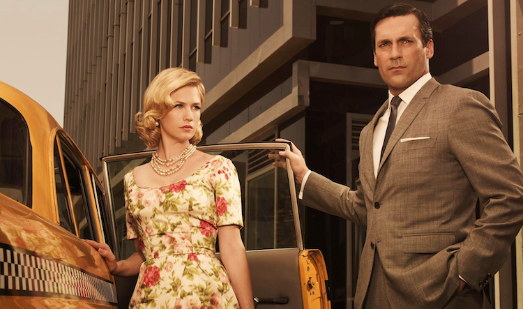
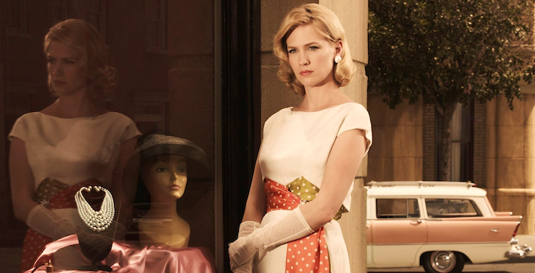
January Jones in "Mad Men."

It’s true that Mad Man depicts the nascent counterculture somewhat caustically, but I wonder whether this merely reflects the show’s implicit alignment with the perspective of the older generation. It seems to me we are supposed to understand that we witness the birth of the counterculture through Don’s eyes, and that the putative inadequacy of his comprehension is one more point against him and his generation.

I wish there were a corrective to adduce, but films like George Lucas’ American Graffiti and Barry Levinson’s Diner are a bit patronizing in their own way, envisioning an aimlessness and harmlessness that has nothing to do with the complexities that were roiling through the culture in a late efflorescence of modernism. For me, the defining tableau is an auditorium at Cornell, Nabokov at the lectern, Pynchon seated amid the crowd.

Posted on February 15th, 2011 at 9:20am.

The Way Back Available on DVD/Blu-ray April 22nd

Colin Farrell in "The Way Back."

By Jason Apuzzo. Special thanks to reader Vince for alerting me to the fact that Peter Weir’s The Way Back, an epic saga starring Ed Harris and Colin Farrell about a breakout from one of Stalin’s gulags, will be released on DVD and Blu-ray on April 22nd. You can pre-order the film below through the LFM store.

We greatly admired The Way Back here at Libertas (see our review here), along with the courage it took to make it, and are glad to see the film making the transition to DVD/Blu-ray so quickly. It’s often frustrating for us to recommend indie films of this kind here on this site, and then have to wait 6 months from their appearance in a film festival or in limited theatrical release for people to be able to see them. Bravo to the team behind The Way Back for making it available so swiftly. This, one hopes, is the way of the future for indie releasing.

Posted on February 15th, 2011 at 9:17am.

Classic Top 6: Film Noir Posters (Foreign Edition)

By Jennifer Baldwin. Before photography (and then Photoshop) took over the movie poster business, illustrators and artists ruled. Billboards, lobby cards, one sheets — these were the domain of the movie art masters, the geniuses who plastered our imaginations with color and drama and a parade of disembodied heads all in various states of emotion. Nowhere, it seems, were the old movie poster artists more unbridled than in their posters for film noir. Violence and sex are everywhere, and the artwork is always fun.  Sometimes the posters are lush and romantic, other times chaotic and carnal. But always interesting, always worth looking at. Whether the movies turn out to be good or bad, the posters always manage to sell them.

In fact, sometimes in the case of the old film noirs, the foreign artwork is better than the American. These foreign posters seem to get to the thematic heart of the stories because the artists weren’t as hampered by the studios to make sure a certain actor was featured or a movie star actress looked glamorous. And because foreign artists often had different sensibilities than their American counterparts, some of the best posters have a distinct strangeness to them that make the artwork even more compelling.  These are my Top 6 picks for best film noir movie posters from foreign countries:

#6:  Belgian poster for Criss Cross (Dir. Robert Siodmak, 1949)
Bold, violent, unrelenting — the red crisscross that dominates the center of the poster might be a bit crude and obvious for a movie titled “Criss Cross,” but it fits this nihilistic, underrated classic perfectly. With Yvonne De Carlo’s gorgeous face looming enigmatically above it, the “X” threatens to cross out both Duryea and Lancaster, two men who are both on a road to annihilation thanks to their lust for Yvonne’s intoxicating femme. What’s even more disturbing than those crisscrossed streaks of blood, though, is the look of cool, indifferent “who cares” on De Carlo’s face. That “who cares” look, as blood rains down, is the essence of the film noir “dangerous woman.”

#5: Italian poster for T-Men (Dir. Anthony Mann, 1948)
The artwork for this poster is flawless. One of the great things about old movie poster art is the way it tells a story. It’s not just one thing — one face, one situation, one image. These old posters take us into the story of the film, almost like the sequential art of a comic book, where we move from character to character, situation to situation, image to image. This T-Men poster gives us pieces of the story, while leaving us hungry for more. The death of a beautiful woman; a bag full of money; a brutal interrogation; a shootout at the pier; and at the center of it all, a heroic Dennis O’Keefe, trying to stand up for what’s right, but surrounded by crime on all sides. Film noir is a black and white genre, yet an eye-popping poster like this one reveals all of the intense, explosive emotions roiling beneath the silver-dark black and white sheen.

#4:  French poster for F.B.I. Girl (Dir. William Berke, 1951)
I’ve never seen F.B.I. Girl. From what I’ve read on the internet, it doesn’t appear to be a very good movie, despite the presence of one of the all-time noir pros, Audrey Totter. But damn, if this poster isn’t the coolest thing ever! Coolness, of course, is one of the attractions of the genre. In fact, some might even argue that film noir isn’t a real genre at all, just a style. And style is about aesthetics, about the “look” of something. In the case of F.B.I. Girl, the movie itself is irrelevant. This poster — the look, the attitude, the style of it — is all we need. There’s a sexiness, a romantic sensibility, to the artwork that seems appropriate for the French. The pinkish red coloring; the playful elegance of the woman in the foreground; the hint of sexual violence between the man and woman in the background — all of it adds up to a retro modern design that is still absolutely fresh. I would kill to have this poster framed and hanging on my wall.

#3:  French poster for Notorious (Dir. Alfred Hitchcock, 1946)
Symbolic, highly stylized, and unlike anything that would have been done in America, this is Hitchcock’s Notorious as only the French can render it. There’s the romantic passion of Cary Grant and Ingrid Bergman’s love affair, which dominates the poster and hangs over every frame of the film; the wine cellar key that is at the center of  Bergman’s espionage and the symbol for her duplicity; and a very stylized version of Claude Rains within the key itself, uniting Bergman’s two acts of deception and betrayal, the betrayal of her husband’s work and his heart. The blue coloring gives the poster a sad romanticism, like the farewell of lovers on a rainy train platform; while the gold works as both the golden hues of warm sunlight (Bergman’s character wants to live in the light) and as the menacing gold of the cellar key. Interestingly, Rains’ face is half gold, half black, perhaps as a symbol for how his character is an evil yet weak man, not so much a villain to be hated but one to be pitied. More than just an advertisement for a movie, this poster works as a compelling piece of art.

#2:  Italian poster for Force of Evil (Dir. Abraham Polonsky, 1948)
This poster just IS noir. One of the few from the era to be almost entirely in black and white, it captures the essential paradox of the genre. The menace of the gun; the threat of violence from a heavy bathed in shadow; the trapped look on the face of illustrated John Garfield — all of the doom and psychological terror of these films, and yet, amidst the crime and despair, there’s a stark beauty to the image. This is the tension at the heart of the noir style: beauty within the darkness. These are dark films, with dark themes. Murder, blackmail, exploitation, cruelty, selfishness, greed. But the artists who create these films, the painters of shadow and light, the directors and cinematographers — they create something beautiful to look at out of stories filled with evil. The illustration for this poster looks like it could be a still photograph from the movie itself. Filled with fear and violence and menace, and gorgeous.

#1:  German poster for Double Indemnity (Dir. Billy Wilder, 1944)
This is number one simply because it looks like the face of Barbara Stanwyck is emerging from Hellfire, her seductive wickedness consuming MacMurray and Robinson in an inferno of murder and lies. If that doesn’t sum up Double Indemnity, I don’t know what does. Stanwyck is all heat in this one, a ball of fire of the deadly variety. MacMurray and Robinson, in their monotone hues, look almost like ghosts, like men reduced to mere shadows by the power of Stanwyck’s evilness. The real relationship in the movie is between the two men, of course. When their friendship is destroyed because of Phyllis Dietrichson, it is that destruction that pains us in the end. She is the devil who comes between them, bringing everything to ruin. This illustration, more than any other, captures these themes. And even more than that, it’s just an electrifying visual design. Everything about this poster just makes me want to watch the movie again right now. It gives new life to a movie I’ve seen dozens of times. And that is the mark of great movie poster.

This article is a contribution to the For the Love of Film (Noir) Blogathon, hosted by Ferdy on Films and The Self-Styled Siren.  Check out the Facebook page HERE and consider supporting the cause of film preservation with a donation.

Posted on February 14th, 2011 at 11:05am.